- Users that convert, not just visit
- A product that looks like you imagine
- Confidence in what to build next
- Design your competitors will notice
- Faster launch with fewer wrong turns
- Complex DeFi mechanics turned into intuitive experiences
- Product that users understand without a tutorial
- Tested and iterated before development starts
- Design system that keeps your team shipping fast
- Full process from research to dev handoff in 6 weeks
- Senior designers who learn your product deeply
- Consistent quality, no re-explaining every project
- Full specialist team under one roof
- No chasing, no handholding, no surprises
- Long-term partners invested in your success
- Faster time to market for your startups
- Consistent quality across every brand
- One design partner instead of multiple agencies
- Senior team that can lead, not just execute
- Pricing built for portfolio scale
- Clear picture of what's holding your site back
- A complete redesign, not a patch job
- Built in Webflow, yours to manage after launch
- Works perfectly on every device
- Interactions that make your site feel alive
- Strategic direction, locked in
- A look that works everywhere
- Logo and guidelines your team can use
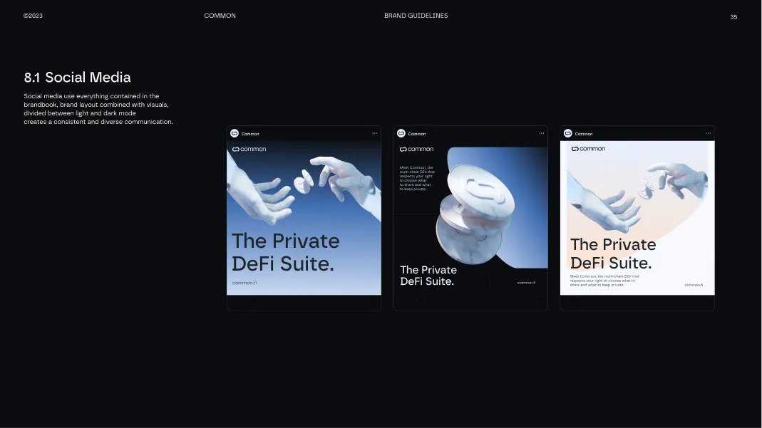
- Social presence people recognize as yours
- Ready to launch from day one
- Strategic clarity, from day one
- Multiple creative directions to choose from
- A brand identity you believe in
- Social presence, ready to post
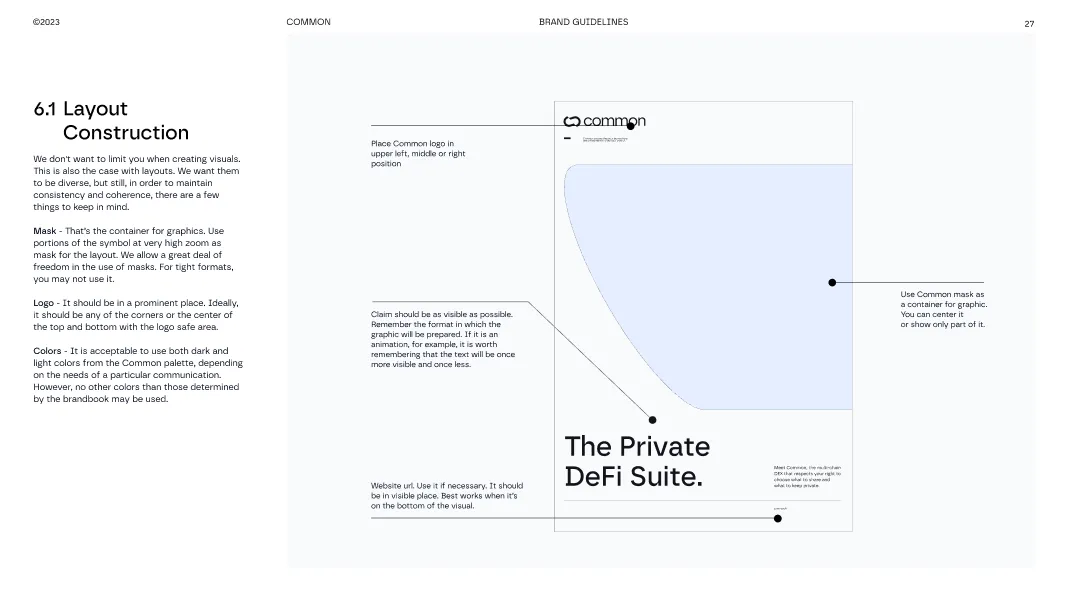
- Consistent everywhere, without guessing

